A World Where Color Is Rare...
by Shawn Hall, Brittany Hanson, and Kyle Woodward
Advertisement #1
Advertisement #2
Movie Poster #1
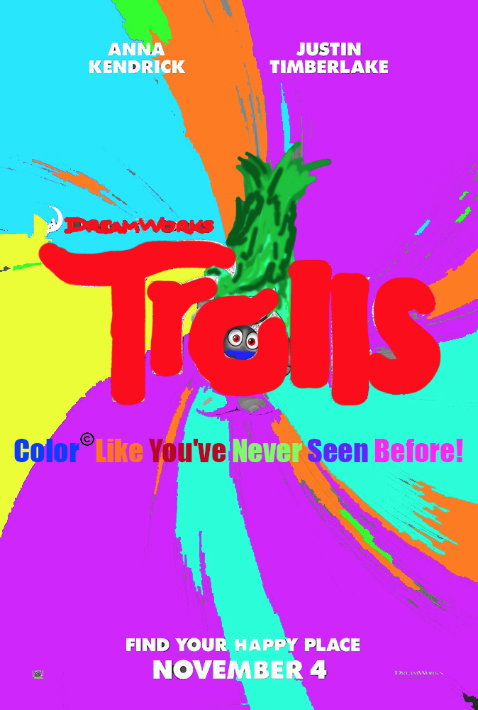
Movie Poster #2
Artist Statement
Imagine a world where color was in limited supply. How would people view color? Could they still find beauty in a colorless world? Who would control the supply of color? Would it be an everyday occurrence? For our world building assignment we explored these questions by creating design fiction. As Bleecker outlined in “Design Fiction”, we used fiction and fact hand in hand by creating our own facts to describe what our colorless society would function like. While the pictures or newspaper article that we used were not entirely real in a sense, we made them real by adding a backstory which added to explaining our futuristic society.
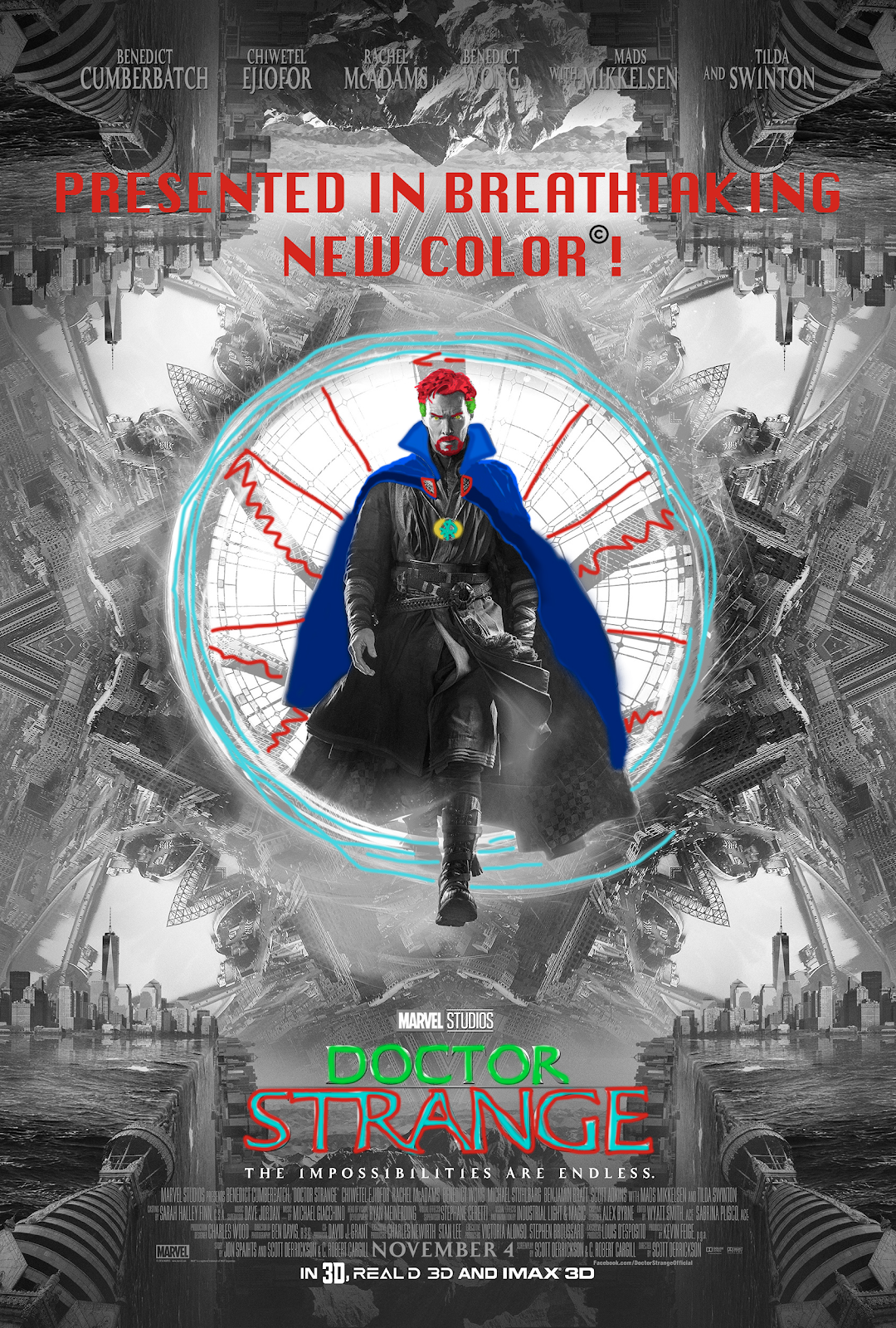
As the newspaper article so aptly describes, we pictured a world burdened by the after effects of nuclear fallout. In this world, color was all but lost and the earth was left only visible in various shades of grey. As technology grew, however, color was soon discovered and re-instigated into society; therefore, we wanted to be able to convey a rather foreign perspective on color. What if we never knew what red or green was? If we could never comprehended such colors, who’s to say the sky would need to be blue? In these various images, particularly the advertisements, we were able to explore a strange smattering of mismatched hues. To these people, color is cool just because it’s color. It wouldn’t necessarily matter to them whether or not it made sense. After all, if they don’t fully understand it, it could never truly make sense to them.
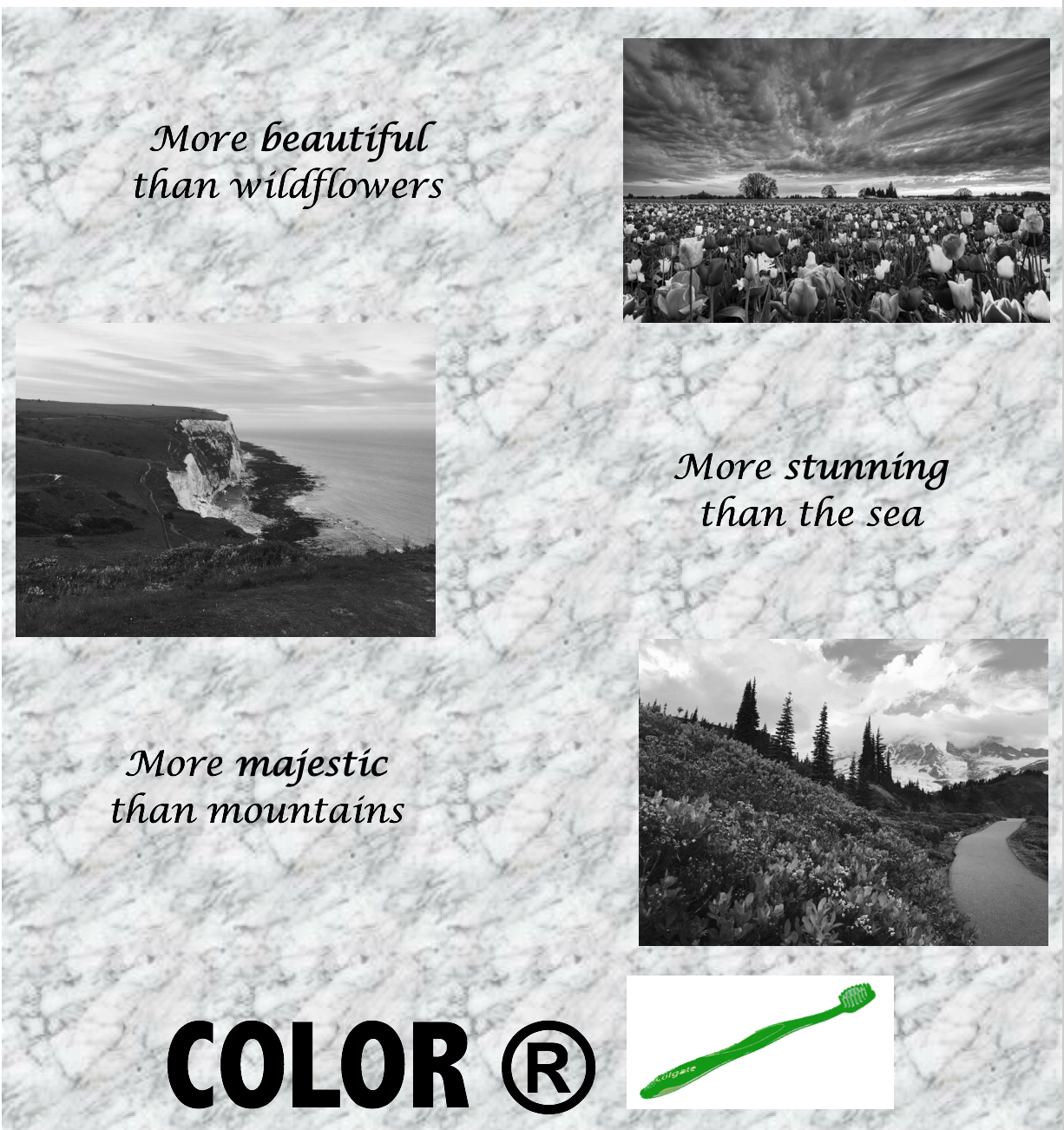
Regardless, we decided that color would ultimately be a luxury and something only the rich could afford to produce. It’s similar to the ideas proposed in the 2011 film, “In Time” where time acts more as a currency than a force of nature. In the film, the rich hoard all the time in the world and are able to live as long as they so desire. Though our idea is much different in nature, those with access to color must needs be of high status.
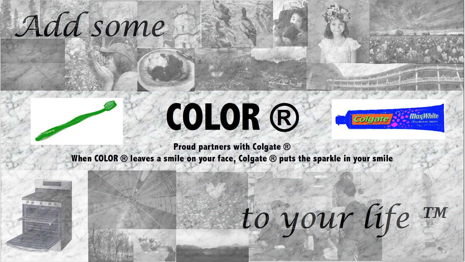
In the advertisements, COLOR is a brand with a restricted trademark, so the word “color” is literally owned by a company, and color itself is only understood artificially, as a product. To people who can only see manufactured or archeologically preserved color, places we recognize as beautiful, such as the wildflower fields in Oregon, the white cliffs of Dover, or Mt. Rainer might not compare in their eyes to a colored toothbrush or tube of toothpaste. In the second advertisement, while all the other photos depicting different aspects of life and nature are black-and-white and faded, the artificially colored tube of toothpaste and toothbrush are the bright focus of the advertisement, suggesting a rather tragic irony: That incredible Greek artwork, British castles, snuggling with a kitty, or stopping to smell the flowers, things that make life “colorful” in the sense that they enrich and enliven our experience, might pale in comparison to the sensation of adding actual color to a rather mundane product.


